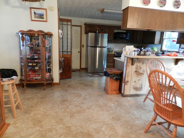
I am happy with the look of the tile. It lightened the kitchen and changed the feel of the room. I need new rugs for the floor - the old ones won't do - and I think I need to do something different for a trash can now, but otherwise I am pleased. Those are minor details that I can take care over time.
Here are photos:
 |
| The dining area without the table. |
 |
| The kitchen area. |
 |
| A close-up of the tile. |
 |
| The kitchen with part of the table and chairs. We took a leaf from the table so it is much smaller than it was. I haven't decided if I'm going to add that back or keep the table tiny. |
 |
| Looking into the area from the living room. Don't you think the trash can needs to be a different color? |
 |
| The kitchen area with the floor mats back. The one in front of the fridge definitely doesn't match now. |
When the time comes I'll show you the new hardwood floor we are putting down to replace the carpeting. We are hoping this will help my allergies. We'll see.

Looks good. The trash can matches the kitchen set in my eyes but I can see what you are saying as well.
ReplyDeletegroutless tile??pretty
ReplyDeleteIt looks great! And what a change from the old flooring.
ReplyDeleteI love how the big tiles look. Modern. Good choice.
ReplyDeleteTile looks good! There are several different shades of wood between the rooms so the trash can works but I get it’s also nice to have new stuff now and then.
ReplyDeleteI like that a lot. Should be easier to keep clean too! I'd change the bin. Maybe one of those brushed chrome or stainless steel Brabantia ones would do - it would match with the fridge.
ReplyDelete